—
zfm
Zeitschrift für Mediendesign
—
Client:
Year:
Service:
—
Zeitschrift für Mediendesign
2022
Website
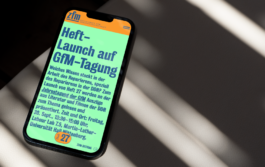
Supercomplex, full of readingtext, content and deepthoughts: The new online platform of the Department for Media Studies is pure color, structure & typography.
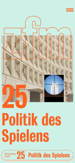
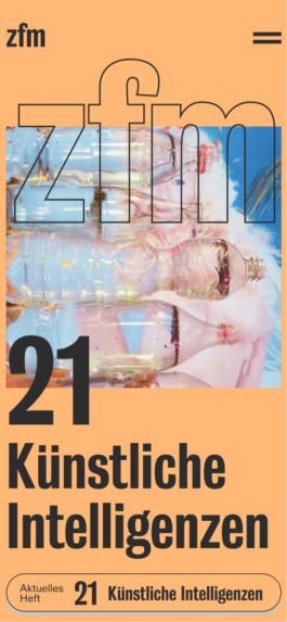
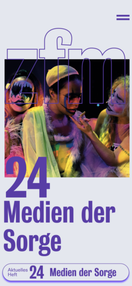
The new zfm webplatform is shining brightly, joyfully and makes reading much easier: Big Type, new and better structure, quotes and more images make the website enjoyable for the young and older crowd of media studies acteurs.
Where do we come from?
Small reading size, monotone colorscheme, hardly images, longscroll pages that don't pay tribute to the excellent content and deep thoughts you find in the media studies department: This was the starting point of this amazing challenge. Once again we were blessed with an openminded, appreciating client that was ready for change.
Structure
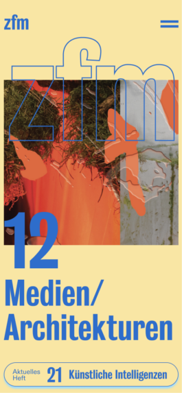
A new structure is the core skeleton in this relaunch. In fact, the result is an entity of both: good, well thought structure of the content plus a good design concept that meets the needs of the users of younger generations as well as the traditional ones. To work out the perfect structure, we decided to start with a workshop including all stakeholders. This need some more that one round – but it was worth it. We identified the targetgroup, we analyzed their needs and put it next to the clients needs. We redefined the purpose of the platform and went brave. The outcome is a colorful yet structured and – most of all – readable platform that has a joy of use aspect and big typography as a main design element.
«How can we make long texts/reading more attractive – also to a generation that is used to a concentration-span of 7 seconds via Tik Tok and Bumble swipes? How can intelligent and good Graphic Design make a difference here?»

—
zfm
Zeitschrift für Mediendesign
—
Client:
Year:
Service:
—
Zeitschrift für Mediendesign
2022
Website

Where do we come from?
Small reading size, monotone colorscheme, hardly images, longscroll pages that don't pay tribute to the excellent content and deep thoughts you find in the media studies department: This was the starting point of this amazing challenge. Once again we were blessed with an openminded, appreciating client that was ready for change.

Structure
A new structure is the core skeleton in this relaunch. In fact, the result is an entity of both: good, well thought structure of the content plus a good design concept that meets the needs of the users of younger generations as well as the traditional ones. To work out the perfect structure, we decided to start with a workshop including all stakeholders. This need some more that one round – but it was worth it. We identified the targetgroup, we analyzed their needs and put it next to the clients needs. We redefined the purpose of the platform and went brave. The outcome is a colorful yet structured and – most of all – readable platform that has a joy of use aspect and big typography as a main design element.

«The first question that arises with a redesign is: radical or cautious? Often there is also a shift towards more radicalism within the process, even if the beginning was perhaps rather cautious. One of our roles as designers is always the role of an encourager.»
{Nina Reisinger}
Solutions
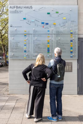
First, we decided on a color system that we can apply to the different inputs and can thus provide visual support. The colors should be loud enough to be seen from a distance and different enough to be distinguished.
Away from the original Neutraface corporate font, we used Futura as the new corporate font in the course of the revision. Also a geometric grotesque, but with more cuts and less 1920s eccentricity. The sober and solid Futura is also used on the website, which we redesigned this year. see here.
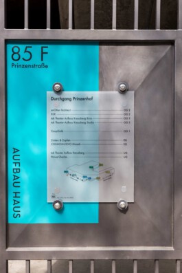
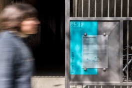
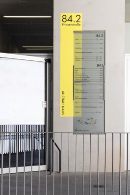
The colors that mark the entrances are slightly offset behind the actual glass signs and painted directly on the wall. By separating the colored area and the actual sign, we wanted to establish a connection with the architecture and not leave the effect of the signage purely flat on one level.
This creates a liveliness and a connection with the different surfaces of the architecture, which ranges from raw concrete, plastered walls to metal.
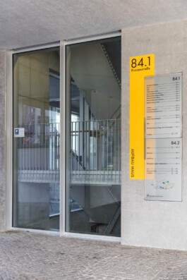
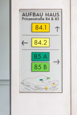
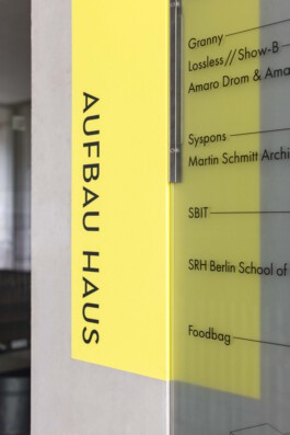
Together with the client, we have developed a signage system for the Aufbauhaus, that we believe takes into account the beautiful architecture as well as the complexity of tenants, specifications and design heritage.
If you are also interested in the development or revision of an orientation system, please do not hesitate to contact us. We look forward to your challenge.
