—
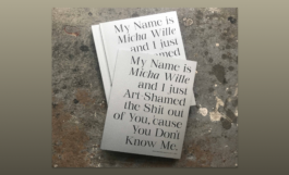
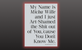
My Name is Micha Wille and I just Art-Shamed the Shit out of You 'cause You Don't Know Me.
Client:
Year:
Service:
Micha Wille
2021
Bookdesign
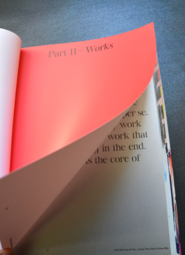
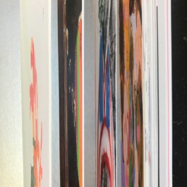
Language and painting are equally balanced in Micha Willes catalog. We wanted to approach the works through language first and image second. Which is rather unusual for a painting catalogue. This 300 pages catalogue is a fulminant blast and overview of Willes work that never stops.
This Book, containing Micha Willes artwork, is full of feminist force, painterly details and strong color. We took a focus on choosing a typeface, designed by at least one female typedesigner (Charlotte Rohde, Serifbabe), and the aim was to create a design that leaves enough space for the artworks, but emphasizes the enourmous force of Willes words and titles that play a huge part in her oevre.
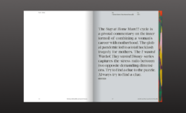
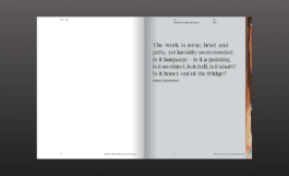
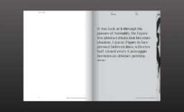
Therefore, gave the quotes equally as much space as the paintings itself. Every artpiece is introduced through a quote by or about Micha Wille. The words are set in typeface Serifbabe, a glamourous yet sharp typeface with feminine capriols. The type is set on a completely silver page. We wanted to emphasize the treasure and worthieness of words by choosing silver – as a reference to the precious metal. Language is equally important to Willes work as the paintings itself.
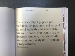
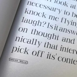
To the side of the quote, you find a very very compressed version of the introduced painting. It serves as an idea on how the colorworld of the painting will evolve. We worked with little typographic details coming from the typeface "Repro" by Erkin Karamemet which are referencing the visual language of comic – just like in Willes work.
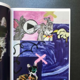
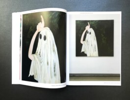
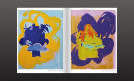
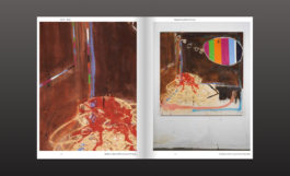
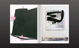
When turning the page, you find a doublespread introducing the formalities of the introduced painting. The dramaturgy of presenting the painting to the reader is not analog to the museums visit, where the viewer approaches the painting from far away and then comes closer. We chose the opposite "movement", analog to the eye of the painter: First the painter paints very close to the canvas, then she needs to step back to see how it all evolves. On the left side of the doublespread, you find selected details of the painting, on the right side, you get the painting in full view.


—
My Name is Micha Wille and I just Art-Shamed the Shit out of You 'cause You Don't Know Me.
Client:
Year:
Service:
Micha Wille
2021
Bookdesign
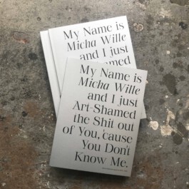
Language and painting are equally balanced in Micha Willes catalog. We wanted to approach the works through language first and image second. Which is rather unusual for a painting catalogue. This 300 pages catalogue is a fulminant blast and overview of Willes work that never stops.

Therefore, gave the quotes equally as much space as the paintings itself. Every artpiece is introduced through a quote by or about Micha Wille. The words are set in typeface Serifbabe, a glamourous yet sharp typeface with feminine capriols. The type is set on a completely silver page. We wanted to emphasize the treasure and worthieness of words by choosing silver – as a reference to the precious metal. Language is equally important to Willes work as the paintings itself.


To the side of the quote, you find a very very compressed version of the introduced painting. It serves as an idea on how the colorworld of the painting will evolve. We worked with little typographic details coming from the typeface "Repro" by Erkin Karamemet which are referencing the visual language of comic – just like in Willes work.

When turning the page, you find a doublespread introducing the formalities of the introduced painting. The dramaturgy of presenting the painting to the reader is not analog to the museums visit, where the viewer approaches the painting from far away and then comes closer. We chose the opposite "movement", analog to the eye of the painter: First the painter paints very close to the canvas, then she needs to step back to see how it all evolves. On the left side of the doublespread, you find selected details of the painting, on the right side, you get the painting in full view.
