—
metiundo GmbH
Visual Identity, CI, Branding
—
Client:
Year:
Service:
—
metiundo GmbH
2021/24, ongoing
Branding, CI
Metiundo — Measuring the Impact
A visual identity for a green tech startup from Berlin: metiundo stirs up the sustainability & smart metering market with vibrant energy and a DNA rooted in design.
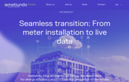
Metiundo is a Berlin-based green tech company using smart metering to drive sustainability in the real estate sector. Their technology makes energy and water consumption visible in real time — enabling data-based decisions that reduce environmental impact.
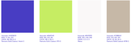
The goal of the visual identity was to position metiundo as a bold pioneer in a traditionally conservative industry. Instead of relying on familiar “eco green” or “tech blue” tones, we deliberately chose an unconventional color system: an electric neon green meets a deep, saturated violet. The result is a high-contrast, recognizable look that communicates clarity and confidence.
The Logo
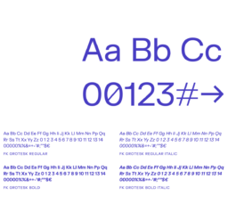
The logo illustrates metiundo’s core idea: making complex data flows understandable and actionable. The chosen typeface — FK Grotesk — supports this concept with its clear, slightly wide-cut forms and subtle technical feel.
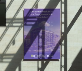
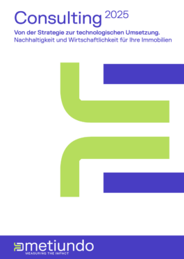
What we did so far: Logo design · Color system · Typography · Visual language · Brand guidelines · Icon set · Website · Templates · Brochures · Exhibition materials (posters, rollups, etc.)
«Creating a brand for a purpose-driven tech company is not about toning things down — it's about showing character. Especially in the sustainability space, design can challenge conventions. If a brand wants to lead, its identity has to take that first step.»
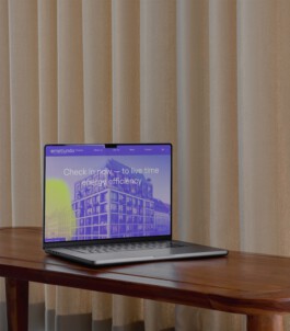
The website UI was developed based on the visual system. It definetely helped to bring the identity to life: the subtle animations of some elements within the site (for example of the energy clouds), the colorblocking and the illustrations merge to a strong visual platform that is metiundo.
Together with the client, we have developed a highly outstanding visual identity for metiundo that marks their spot in the market and shows, that the topic of sustainability can also be communicated in a colorful, vibrant and bold way.
If you are also interested in the development or revision of an visual identity, please do not hesitate to contact us. We look forward to your challenge.
—
metiundo GmbH
Visual Identity, CI, Branding
—
Client:
Year:
Service:
—
metiundo GmbH
2021/24, ongoing
Branding, CI
Metiundo is a Berlin-based green tech company using smart metering to drive sustainability in the real estate sector. Their technology makes energy and water consumption visible in real time — enabling data-based decisions that reduce environmental impact.
The goal of the visual identity was to position metiundo as a bold pioneer in a traditionally conservative industry. Instead of relying on familiar “eco green” or “tech blue” tones, we deliberately chose an unconventional color system: an electric neon green meets a deep, saturated violet. The result is a high-contrast, recognizable look that communicates clarity and confidence.
The Logo
The logo illustrates metiundo’s core idea: making complex data flows understandable and actionable. The chosen typeface — FK Grotesk — supports this concept with its clear, slightly wide-cut forms and subtle technical feel.
What we did so far: Logo design · Color system · Typography · Visual language · Brand guidelines · Icon set · Website · Templates · Brochures · Exhibition materials (posters, rollups, etc.)
«The first question that arises with a redesign is: radical or cautious? Often there is also a shift towards more radicalism within the process, even if the beginning was perhaps rather cautious. One of our roles as designers is always the role of an encourager.»
{Nina Reisinger}
Solutions
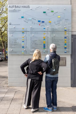
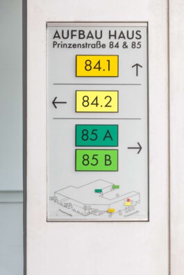
First, we decided on a color system that we can apply to the different inputs and can thus provide visual support. The colors should be loud enough to be seen from a distance and different enough to be distinguished.
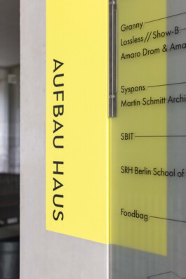
Away from the original Neutraface corporate font, we used Futura as the new corporate font in the course of the revision. Also a geometric grotesque, but with more cuts and less 1920s eccentricity. The sober and solid Futura is also used on the website, which we redesigned this year. see here.
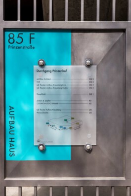
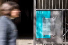
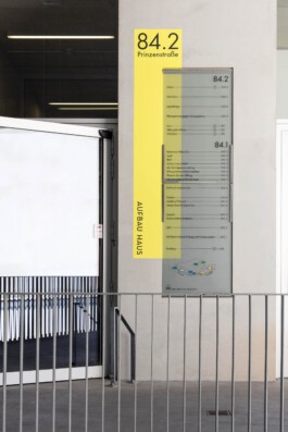
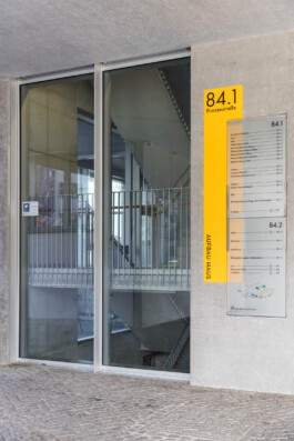
The colors that mark the entrances are slightly offset behind the actual glass signs and painted directly on the wall. By separating the colored area and the actual sign, we wanted to establish a connection with the architecture and not leave the effect of the signage purely flat on one level.
This creates a liveliness and a connection with the different surfaces of the architecture, which ranges from raw concrete, plastered walls to metal.
Together with the client, we have developed a signage system for the Aufbauhaus, that we believe takes into account the beautiful architecture as well as the complexity of tenants, specifications and design heritage.
If you are also interested in the development or revision of an orientation system, please do not hesitate to contact us. We look forward to your challenge.