—
Aufbau Haus
Orientationsystem
—
Client:
Year:
Service:
—
Aufbau Haus
2022
Orientationsystem
How to develop the best orientation within a complex architectural milestone in the heart of Berlin
The Aufbau Haus in Berlin/Kreuzberg is more than just a creative hub: It defies the logic of the capitalist real estate market by offering and maintaining affordable studio spaces for creatives and political institutions.
The Aufbau Haus
The Aufbau Haus at Moritzplatz is a wonderful place. There is still affordable space here for artists and creative people, for political institutions and think tanks – in the middle of an overpriced city whose rents nobody else can afford anymore. No wonder then that many different creative parties work together in this house: architects, political educational institutions, designers, artists, film productions, publishers, design schools, gastronomy, party locations, theatres, retail and much more.
In order to find our way around with so many tenants, we were asked to revise the guidance system of the Aufbauhaus in such a way that it does justice to the complexity of the tenant structure as well as the architecture.
The architecture
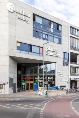
The architecture of the house is special and an eye-catcher on Moritzplatz. The concrete and glass building is a nod to modernist architecture. Not to be compared with the fast houses that have shot up around Moritzplatz for a wide variety of startups in the last 5 years.
However, the genesis of the house already brings with it a difficulty: the architects Clarke and Kuhn were commissioned to renovate the factory building at Prinzenstraße 85, while the new part of the building at Prinzenstraße 84 was built by the architects Barkow Leibinger. So there are two parts that should be perceived as one. A challenge for us.
«The first question that arises with a redesign is: radical or cautious? Often there is also a shift towards more radicalism within the process, even if the beginning was perhaps rather cautious. One of our roles as designers is always the role of an encourager.»
Challenges
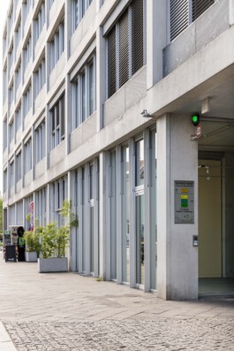
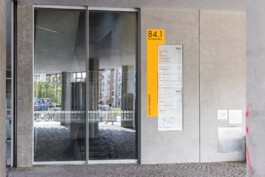
The Aufbau Haus has many different entrances and runs along two major streets in Kreuzberg/Berlin. So how can we ensure a logical house number and orientation system in which postal workers and suppliers can easily find their way around?
What requirements do visitors, tenants or theater guests have? How to show accessible entrances? What means do we use to mark the entrances, etc.
The main requirement for the implementation was to take over the existing glass panels and technical devices of the old orientationsystem. What is the best way to deal with the legacy of the previous system? What do we take on? What are we rethinking?

Solutions
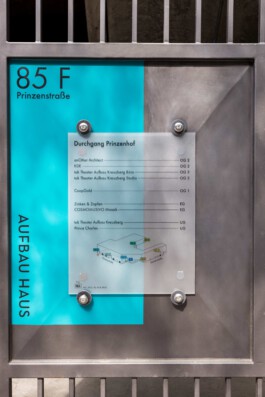
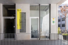
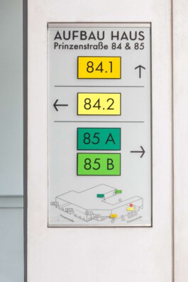
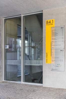
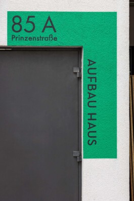
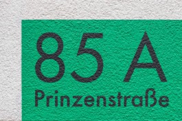
First, we decided on a color system that we can apply to the different inputs and can thus provide visual support. The colors should be loud enough to be seen from a distance and different enough to be distinguished.
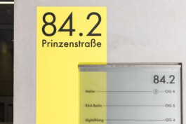
Away from the original Neutraface corporate font, we used Futura as the new corporate font in the course of the revision. Also a geometric grotesque, but with more cuts and less 1920s eccentricity. The sober and solid Futura is also used on the website, which we redesigned this year. see here.

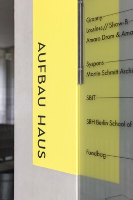
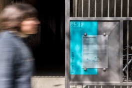
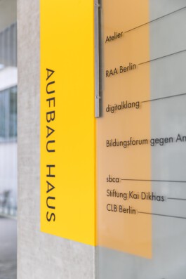
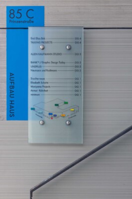
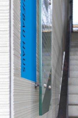
The colors that mark the entrances are slightly offset behind the actual glass signs and painted directly on the wall. By separating the colored area and the actual sign, we wanted to establish a connection with the architecture and not leave the effect of the signage purely flat on one level.
This creates a liveliness and a connection with the different surfaces of the architecture, which ranges from raw concrete, plastered walls to metal.
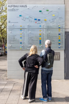
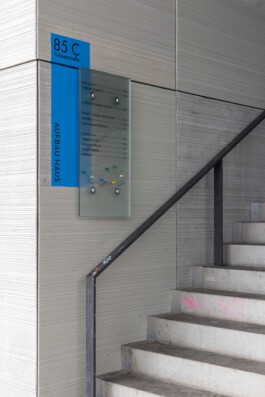
Together with the client, we have developed a signage system for the Aufbau Haus, that we believe takes into account the beautiful architecture as well as the complexity of tenants, specifications and design heritage.
If you are also interested in the development or revision of an orientation system, please do not hesitate to contact us. We look forward to your challenge.

—
Aufbau Haus
Orientationsystem
—
Client:
Year:
Service:
—
Aufbau Haus
2022
Orientationsystem

The Aufbau Haus
The Aufbau Haus at Moritzplatz is a wonderful place. There is still affordable space here for artists and creative people, for political institutions and think tanks – in the middle of an overpriced city whose rents nobody else can afford anymore. No wonder then that many different creative parties work together in this house: architects, political educational institutions, designers, artists, film productions, publishers, design schools, gastronomy, party locations, theatres, retail and much more.
In order to find our way around with so many tenants, we were asked to revise the guidance system of the Aufbauhaus in such a way that it does justice to the complexity of the tenant structure as well as the architecture.

The architecture
The architecture of the house is special and an eye-catcher on Moritzplatz. The concrete and glass building is a nod to modernist architecture. Not to be compared with the fast houses that have shot up around Moritzplatz for a wide variety of startups in the last 5 years.
However, the genesis of the house already brings with it a difficulty: the architects Clarke and Kuhn were commissioned to renovate the factory building at Prinzenstraße 85, while the new part of the building at Prinzenstraße 84 was built by the architects Barkow Leibinger. So there are two parts that should be perceived as one. A challenge for us.

Challenges
The Aufbau Haus has many different entrances and runs along two major streets in Kreuzberg/Berlin. So how can we ensure a logical house number and orientation system in which postal workers and suppliers can easily find their way around?
What requirements do visitors, tenants or theater guests have? How to show accessible entrances? What means do we use to mark the entrances, etc.
The main requirement for the implementation was to take over the existing glass panels and technical devices of the old orientationsystem. What is the best way to deal with the legacy of the previous system? What do we take on? What are we rethinking?


«The first question that arises with a redesign is: radical or cautious? Often there is also a shift towards more radicalism within the process, even if the beginning was perhaps rather cautious. One of our roles as designers is always the role of an encourager.»
{Nina Reisinger}

Solutions
First, we decided on a color system that we can apply to the different inputs and can thus provide visual support. The colors should be loud enough to be seen from a distance and different enough to be distinguished.
Away from the original Neutraface corporate font, we used Futura as the new corporate font in the course of the revision. Also a geometric grotesque, but with more cuts and less 1920s eccentricity. The sober and solid Futura is also used on the website, which we redesigned this year. see here.
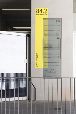
The colors that mark the entrances are slightly offset behind the actual glass signs and painted directly on the wall. By separating the colored area and the actual sign, we wanted to establish a connection with the architecture and not leave the effect of the signage purely flat on one level.
This creates a liveliness and a connection with the different surfaces of the architecture, which ranges from raw concrete, plastered walls to metal.


Together with the client, we have developed a signage system for the Aufbauhaus, that we believe takes into account the beautiful architecture as well as the complexity of tenants, specifications and design heritage.
If you are also interested in the development or revision of an orientation system, please do not hesitate to contact us. We look forward to your challenge.
