—
Aufbau Haus
Website Relaunch
—
Client:
Year:
Service:
—
48 Stunden Neukölln
2023
Relaunch Visual Identity
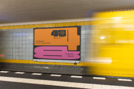
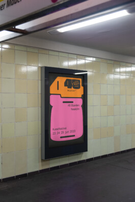
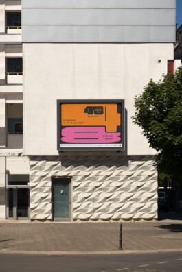
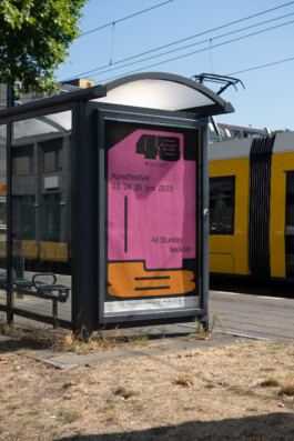
The art-festival 48 Stunden Neukölln celebrates diversity, color and the contrasts of the legendary Berlin district Neukölln for the 25th time this summer.
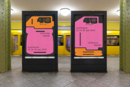
For many years, the yearly art- and cultural festival takes places in many different locations in Berlin Neukölln. For 48 hours, the district is being transformed into a huge stage of many small venues - from the Café to the Spätie, from the art exhibition place to bars or even private apartments: You will find art, music, literature, political statements and get-together everywhere in Neukölln on this special weekend in june. The new visual identity we developed for 48 Stunden Neukölln mirrors the diversity and colorfulness of the district: bold, soft, friendly and orange/pink...
More Information soon.
—
Aufbau Haus
Website Relaunch
—
Client:
Year:
Service:
—
48 Stunden Neukölln
2023
Relaunch Visual Identity
More Information soon.


«The first question that arises with a redesign is: radical or cautious? Often there is also a shift towards more radicalism within the process, even if the beginning was perhaps rather cautious. One of our roles as designers is always the role of an encourager.»
{Nina Reisinger}
Solutions
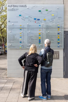
First, we decided on a color system that we can apply to the different inputs and can thus provide visual support. The colors should be loud enough to be seen from a distance and different enough to be distinguished.
Away from the original Neutraface corporate font, we used Futura as the new corporate font in the course of the revision. Also a geometric grotesque, but with more cuts and less 1920s eccentricity. The sober and solid Futura is also used on the website, which we redesigned this year. see here.
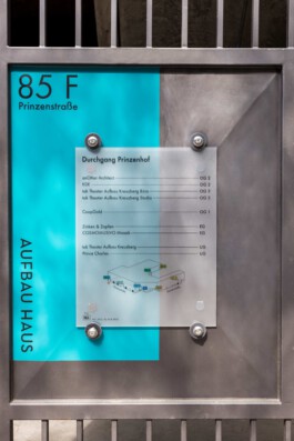
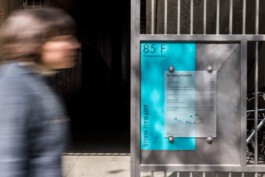
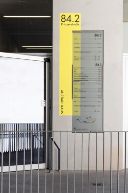
The colors that mark the entrances are slightly offset behind the actual glass signs and painted directly on the wall. By separating the colored area and the actual sign, we wanted to establish a connection with the architecture and not leave the effect of the signage purely flat on one level.
This creates a liveliness and a connection with the different surfaces of the architecture, which ranges from raw concrete, plastered walls to metal.
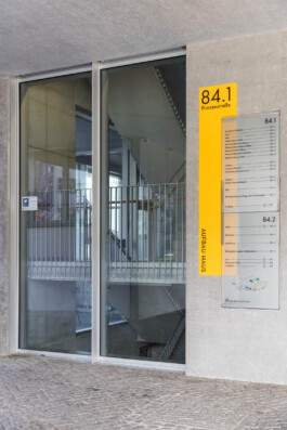
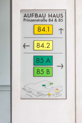
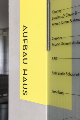
Together with the client, we have developed a signage system for the Aufbauhaus, that we believe takes into account the beautiful architecture as well as the complexity of tenants, specifications and design heritage.
If you are also interested in the development or revision of an orientation system, please do not hesitate to contact us. We look forward to your challenge.
